Friday, September 4, 2009
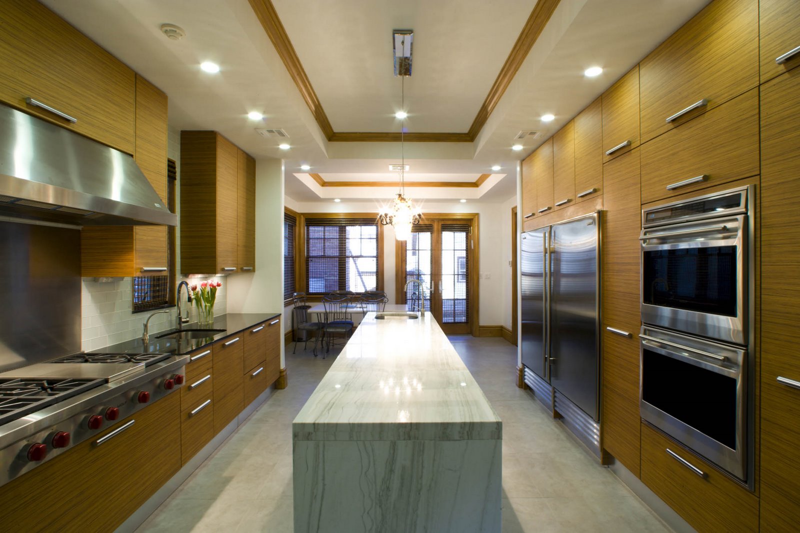
Black And White Kitchen Design Ideas
Публикувано от homedecor в 11:37 AM
Thursday, July 2, 2009
Now! no.12 is a new collection of stylish and beautiful furniture from great Germany company, Hülsta. It combines apparent contrasts: new naturalness meets cool high-gloss surfaces, traditional oak meets brilliant white. It utilize “push-to-open” technology everywhere – there are no knobs and no handles. Nothing distracts you from the simple and minimalistic look of the surfaces. Natural oak provides warmth and comfort when high-gloss fronts add a cool touch.
There are four styles for different living concepts, linked by clean and simple lines. The furniture is made for different rooms: living room, bedroom, dining room and study room. With furniture from this collection everybody can achieve highly individual, modern and simple style around their house. To get more info about individual furniture pieces from the collection visit Hülsta website.
Furniture for dining room
Furniture for study room
Публикувано от homedecor в 8:54 PM
Small Kitchens - Space Tips
 To make a small kitchen look larger, use the same material or colors on the cabinets and counters.
A checkerboard design on the floor can help a small kitchen seem larger.
Planning cabinet storage for small appliances will keep counters clutter-free.

The soffit area above cabinets is a perfect place to incorporate storage.
Kitchen islands don’t have to be large. A small compact island can be designed to provide storage, seating and counter space.
When locked into a footprint, go vertical. Adding height gives you opportunity to create more storage and introduce light in a room.

Designing cabinets up to the ceiling ensures optimum use of kitchen space.
Make small rooms feel bigger by adding windows to bring in more sunlight.
Публикувано от homedecor в 8:49 PM
Tuesday, April 21, 2009
Interior Design Tips for Small Space
 Furniture on wheels is easy to move out of they way or use in another room.
 Keep your furniture away from the walls even in small spaces.
 Find creative ways to divide spaces. Dining Room
 Don't skimp on light fixtures. They finish a room, draw your eye up and make a room feel
larger. dining room living room
 Buy the right sized furniture for the space. Not too big not to small, just right. Accessoaries
 Keep accessories neat and organized and if you rent remember that when you design with accessories you can take them with you when you go.
Публикувано от homedecor в 3:45 PM
Sunday, April 12, 2009
Interior Design Pictures - Pictures of Living Rooms
In interior design, a focal point is important in every room. It could be a large window or painting or an interesting art piece. In your living room, arrange your furniture around a focal point. Put your biggest piece of furniture first (like the sofa) then continue with the smaller pieces of furniture down to your accent pieces.
● Consider the size of your living room when you buy the furniture. Don't buy oversized pieces if your room is not that big. It will make your room smaller and cramped. And also don't buy tall furniture if your ceiling is low, they will make the ceiling appear lower.
Picture of Living Room 1
Picture of Living Room 2
Many of us Filipinos tend to buy living room furniture "sets" with a sofa, two matching side chairs, with matching coffee and side tables. Be different, don't match the couch with the side chairs. In fact, in interior design, it is more fashionable to have different styled pieces put together like a modern sofa with classic or antique side chairs and different styled tables.
● If you plan to put several picture frames on the walls. it is a good idea to group them together by theme and arrange them inside an imaginary frame. They can be the focal point of the room.
● Before you buy you dining room set, take a good look at your space. Be sure that there is ample room to walk around the dining set even if all the seats are occupied. Interior design has a lot to do with ergonometrics, not just appearance. We Filipinos have the tendency to buy bigger dining sets than our space can accommodate and push one side of the table against the wall.
Picture of Living Room 3
Picture of Living Room 4
If your living and dining area is on the same room, you may use a different flooring material on the dining area to delineate the space from the living area. Or you may put an area rug on your dining area for definition. A free standing screen is another good option.
● Avoid using fluorescent (white) lighting in the living and dining areas. Food looks more inviting under incandescent (yellow) light and people's complexion too look better under yellow light. But if you really like to use fluorescent light, combine both white & yellow light at the same time.
● If you plan to put a chandelier above your dinning table, don't put it up so high. Lower it 3 to 4 feet from the table top.
● Aside from your direct light source above the dining table (a chandelier for example), add some pin lights around the room and a dimmer switch to make your surroundings more pleasing to the eye. Do the same with your living room.
● It is ok to put family pictures on the living room but don't put so many, specially school diplomas and trophies. They are better put in the den or your bedroom.
Picture of Living Room 5
Picture of Living Room 6
Modern Living Room in Earth Colors (Living room 7)
Публикувано от homedecor в 12:01 PM
Refined style in modern design
Mixing patterns - Eklektikata in interior design is established as a new trend in 2009. Is mixed styles and periods, each unique footprint left at home.
"Go green" - environmentalists and social organizations to put producers and dealers of furniture and household items imperative requirements for compliance ekonormite. Not only the end product but also the very process should meet the technical and legal requirements for safe and healthy proizvodstvo.Samite companies using green wool producers such as advertising strategy.
Artististizmat idea of uniqueness and are leading in interior design negate mass, nepersonalizirano proizvodstvo.Rachnata work is worship vnyakoi collections.
Eco luxury - Using Eco obzavezhdaneto materials in question of prestige and high style. Leading fashion designers of home full set of natural silk, wool, cotton and deny sintetikata.Boite naturally are non-toxic.
In modern decorative accessories and furnishings are generally leads to the Art Deco and Art Nouveau - animal and botanical motifs, geometric figures.
Style, which is required in ineriorniya shocks design is a mix of art, modern technology, crafts.
The house - a fortress-efforts of many designers is creating intimate atmosphere in every home, focusing on the possibility of relaxation and sequestration. Forms and materials are light and cleaned and create a sense of closeness to nature.
Refined style in modern design for the home often pregrashta classic models and transform them into intransitive elegance.
Hand made in 2009 is also a consideration. It is for people to stay away from "modern" interior styles and keep the tradition.
Colors - There are several main trends in choice of colors for the house in the new year.
Another group of colors and collate urbanizma lives close to nature. The city turns into a - natural, comfortable living space with gardens on roofs and vertical landscaping. The cold gray of the building is in a unique way combines with organic, vivid colors like green, red brass, bronze, brown, sandy.
Complex, deep colors created millions of small dots of two or more different colors (purple, mustard, etc.). These colors should be used cautiously and with flair.
Colors that reflect individuality - bright, bold and unexpected mixes.
Публикувано от homedecor в 11:16 AM